What is the article about?
How can the C4 model be used to increase the quality and comparability of architecture documentation? This article looks at common problems when creating architecture diagrams using traditional methods, e.g. UML or UML diagrams. The C4 model is presented as a solution for creating clear, semantically meaningful and detailed diagrams. You will also receive practical tips on implementing and using the C4 model in companies. Find out more now!
Why another framework for diagrams?
Have you ever had to draw an architecture diagram for your job? I assume yes! While the used means (Whiteboard, Miro board, draw.io, etc.) don’t really matter, I assume that you just started scribbling right away and ended up connecting boxes with edges. While doing so, you started to add custom labels, either on the edges or on the boxes. You may have started using different shapes for different types of artifacts on your diagram, such as the typical silo for data storage.
So, your final diagram might look like this:

Although this made-up system is now visually documented, the chosen approach has some major drawbacks, and the viewer may be left alone with questions that the diagram doesn't answer.
Issue #1: Vendor-specific icons
While AWS-experienced engineers can easily see that the orange icons refer to EC2 instances (virtual machines), engineers used to other cloud providers may not notice this right away.
Issue #2: Custom semantics (or lack of semantics)
While we now have a happy set of boxes connected by edges, there is no clear semantics attached to them. While the edges connected to the user have clear labels, the other edges are missing any labels. Even if you would put labels on all edges, what information would you put there? The technology used, the protocol, or something else entirely?
Issue #3: Lack of detail
To get an idea of the ACME INC storefront system, the diagram may be enough. But what if you would like to know more about the internals of the web server? The diagram does not provide this information. And how would you create a diagram in such a way, that this technique would apply to all your diagrams? So that your “detailed” diagrams would be comparable to other people's team diagrams?
At university they told me I could just use UML...
...and according to my working student, lecturers still like to teach this today ;-)
While the C4 model attempts to address the above issues, you may ask yourself: but what about existing standards for diagramming, such as the UML diagram?
While UML can still provide decent value today, using certain diagram types (e.g. sequence diagrams in my personal experience), the standard was originally created in the era of Java 1.4, when object-oriented programming was the measure of all things and Infrastructure-as-code was, at best, a promising concept on the horizon.
In short, UML and UML diagrams will not help you document and visualize modern software architectures today – or to put it in a meme:
C4 model in a nutshell
The official website of the C4 model is a very good starting point for learning more about the model. Nevertheless, I would like to give a brief introduction to what the model does better than our own semantics used in our ACME INC storefront example.
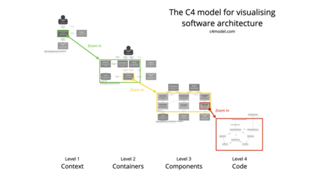
The core idea of the C4 model is to look at software systems from four different zoom levels. Each zoom has a different level of detail and can therefore address information to different stakeholders (i.e. the highest level can also be used for higher management, while lower levels are more suitable for engineers only). Each level starts with a “C”, hence the name C4. Let’s dive into each level:
Level 1: Context (context diagram)
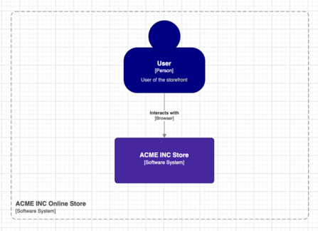
Your C4 journey usually starts at the first level: the system context diagram. This diagram is a high-level diagram of your software system, showing the actual system as a black box, with its details, such as the services, databases, etc., hidden. At this level, your primary actors of the system are also shown, along with the surrounding external systems.
This diagram is very suitable to be shown to non-technical people in your organization, such as product owners, stakeholders and management. For many systems, this diagram may not look very complex or detailed, but this is the whole idea of the system: Show the system as a black box with its primary users and surrounding systems. Nothing more.
Level 2: Container (container diagram)
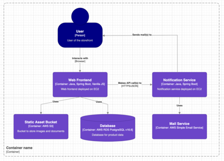
While the system context diagram gives you a (very) brief overview of the system and its surroundings, the most interesting diagram type is the container diagram. You “get” to this diagram by “zooming” into the black box system diagram from the previous level.
On this diagram, all relevant “containers” or infrastructure resources are drawn and connected where they are interdependent (e.g. a Java backend is connected to a Mongo database because the Java service stores its data in a Mongo collection).
While containers make most engineers think of Docker containers, a container refers to a single deployable unit of the system that the system needs to fulfil its intended purpose. So, a container can be a Java application, deployed on Kubernetes, but it can also be a database instance, a Redis cache, a S3 bucket, or any other cloud resource that your application needs to work.
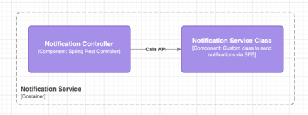
Level 3: Component (component diagram)
If you “zoom” into a container from the previous level, you will reach the component diagram of that particular container. While you will not be able to draw a component diagram of S3, as the source and its internals are not publicly available, you can do so for your Java backend.
Each component on this diagram typically refers to a class in your application, module or library. In large systems, this diagram can potentially become very confusing, so it’s important to think about the purpose of the diagram: What do you want to show to your audience? Is it a particular call chain through your system? Or do you want to show the specific modularization of the system and how the modules use each other?
Don’t just add all the possible components to this diagram. You will lose a lot of clarity if you do.
Level 4: Code (source code)
The final level of the C4 model is simply your source code. If you want to make a diagram out of your code, UML might be a good choice – but commonly you would just review the code together with the target audience (i.e. your co-workers or other engineers in your organization).

If you recognize the source snippet, send me a DM on LinkedIn. ;-)
And by reaching level 4, we have successfully transformed our initial diagram using a self-made notation into valid C4 diagrams that are easier to read and understand.
Beyond the basics of C4
Throughout this article I’ve shown how to easily transform a custom diagram into a set of C4-compliant diagrams. But this is just the tip of the iceberg. Using the C4 model over the last couple of years has give me several insights that I have summarized into the following five tips:
Tip #1: Use predefined shapes
While you could draw the C4 shapes manually, you should take the approach of using predefined shapes that are available for many common diagramming tools, such as draw.io or mermaid.
Tip #2: Store your diagrams in Git
Regardless of whether you are diagramming manually with draw.io or leveraging the docs-as-code approach with mermaid, you should always store your diagrams in a Git repository. This allows co-workers to check out the diagrams, make changes, and create a pull request for their changes.
This way, any changes made to your diagrams will be safely stored and won't get lost on someone’s private OneDrive, or even worse, on their local hard drive. You can also leverage the possibility to release new diagrams automatically to Confluence or a static web page when a pull request is merged.
Tip #3: Focus on the first two levels when starting
While the C4 model offers up to four models, in my experience the most valuable and used ones are level 1 and 2. So starting with level 1 and then creating a sophisticated level 2 diagram will already increase the quality of your documentation. For most systems, it is perfectly acceptable to skip level 3, because a well-built application will tell you most of what you need to know by itself at level 4.
Tip #4: Use the C4 diagrams as the basis for discussion and make it the default
When you start using the C4 notation, it’s crucial that you start using the diagrams as the basis for discussion in any kind of technical discussion. Don’t leave it up to the teams to decide which notation to use, but rather encourage them to embrace C4 as it can become the common documentation language of your organization. If you’re not going pro (see tip #5), the teams can still decide which tool to use for documentation.
Tip #5: Go pro with hosted tools such as Lucidchart or Icepanel
Beyond a certain size of your organization, it may make sense to go with a hosted diagramming tool. A centralized tool can help you to increase the visibility of your system landscape, which is helpful when designing new systems or making changes to existing infrastructure.
All involved stakeholders can easily access the latest version of a system at a click, without having to search through huge Confluence spaces or vast Github organizational structures and start the guessing game: Is this the latest version of the system? Sure, this approach comes with a price tag, but it will increase the quality of your overall documentation and centralize it under one roof.
Want to be part of the teams?
3Comments
- Oskar30.04.2025 16:08 Clock
Thanks, I like C4-model as well. For IntelliJ users, I can recommend the free plugin PlantUML. It provides an editable .puml file and preview option for the document. The .puml file can be versioned in Git as well.
- 27.05.2025 11:03 Clock
Hi Oskar,
thanks for sharing your tip. In the past I also was using PlantUML along with the C4 shapes to document architectures but some co-workers argued, that the look and feel of PlantUML diagrams is not "so modern" - I somewhat share this opinion, because I personally think diagrams should be appealing, yet the content is more important so PlantUML is a valid approach, too.
All the best from Hamburg,
Marvin - 11.06.2025 12:59 Clock
Goodwill bins are large industrial containers filled with unsold donations from retail Goodwill stores. These items didn't sell after being rotated through regular stores, so they're sent to outlet locations to be sold in bulk. The pricing model is simple: you pay by weight, not per item. Clothing typically costs $1–$2 per pound, while books, electronics, and other goods may have different rates.
Written by

Similar Articles
 NinaMarch 16, 2026
Terraform Tips: Securing Infrastructure-as-Code with Terratest – Part 3
01Learn how to test Terraform modules with Terratest, detect errors early on and reliably secure IaC in CI/CD pipelines. 🖥️✔️Data scienceDevelopmentCloud- Team JarvisDecember 17, 2025
Learning to Rank is Rocket Science: How Clojure accelerates Our Machine Learning with Deep Neural Networks
015Learn how OTTO uses 🖥️ Clojure to build robust machine learning pipelines for learning to rank 🚀 and improves the search experience.DevelopmentMachine learning


